Let’s discuss artwork for a few minutes, can we? One of the great things about having portraits taken of your family today is all the possibilities you have for turning those portraits into gorgeous artwork for your home! It used to be that if you went to have a professional family picture taken, most people would come out with the same result to hang on their wall…a great print of everyone looking straight at the camera and smiling. And while that is one way of capturing your family, I want to discuss a few other options with you before you tackle those professional family pictures.
Some things to consider:
- Types of portraits
- Portrait sizes
- Print mediums
A Classic,Traditional Portrait
Here it is, the classic family picture. Everyone is looking at the camera. Usually everyone is smiling. The focus is entirely on the people in the picture, which is ALWAYS the most important part of any portrait in my book.
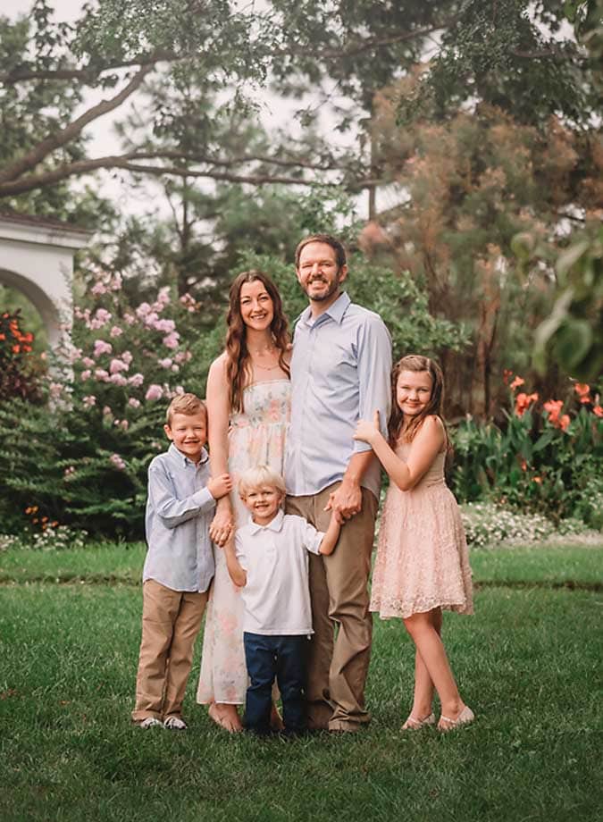
Obviously, you can never go wrong with a classic and beautiful family portrait. But let’s expand it out just a little…
Including the Scene with a Traditional Portrait
While a classic portrait is beautiful no matter which way you slice it, showing more of a gorgeous surrounding can often add interest and dimension, giving more of an artistic feel to the overall image…
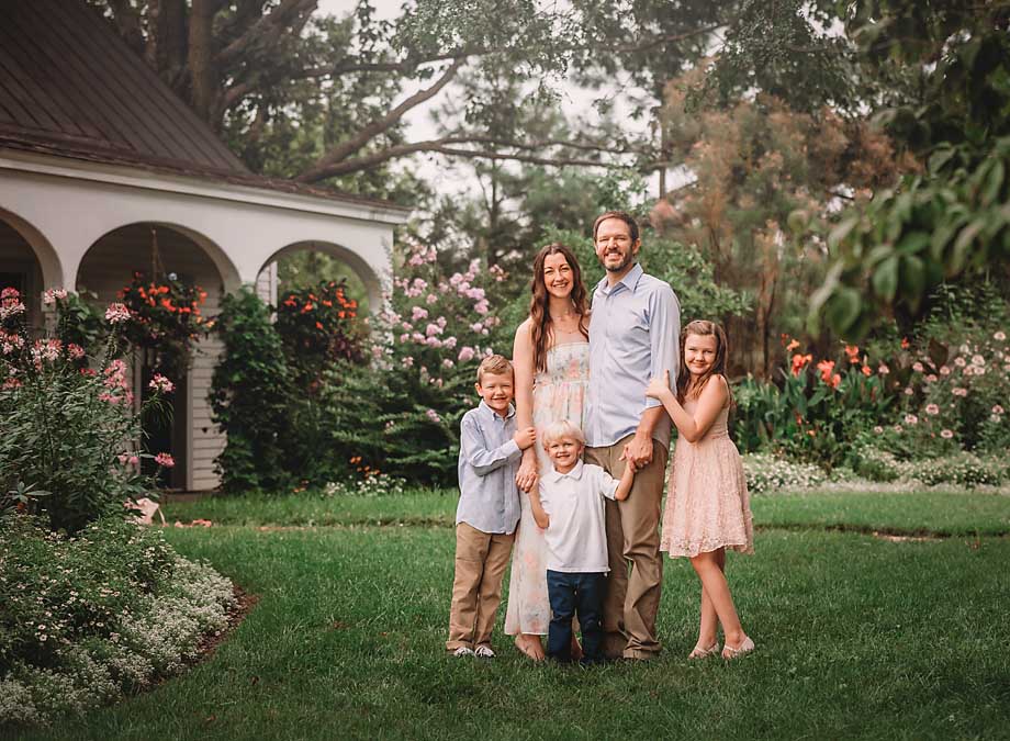
The same beautiful family, the same classic portrait…but more of the gorgeous scene around them. Now let’s consider this…
Connection with Each Other
Yes, a classic portrait is beautiful. But often I’m drawn most by connection…and not connection with me or the camera. What I LOVE, LOVE, LOVE is the connection between those who are in front of the camera. Take a look at this one…
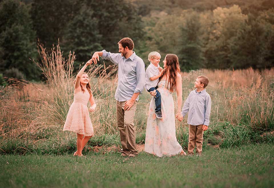
Or this one…
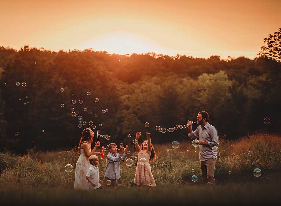
Or let’s not forget this one…

Ahhhh…
Is it just me, or do you find something incredibly beautiful with those images as well?
When you book a session with me, I work hard to give you a variety in your portraits, just like you’ve seen of this family. Yes, we get the classic portrait, but then I also go after those connections. What I’d love for you to start thinking about before your session is which ones appeal most to you, and then let me know! It helps me to know what to prioritize as I’m photographing your session.
Size Matters!
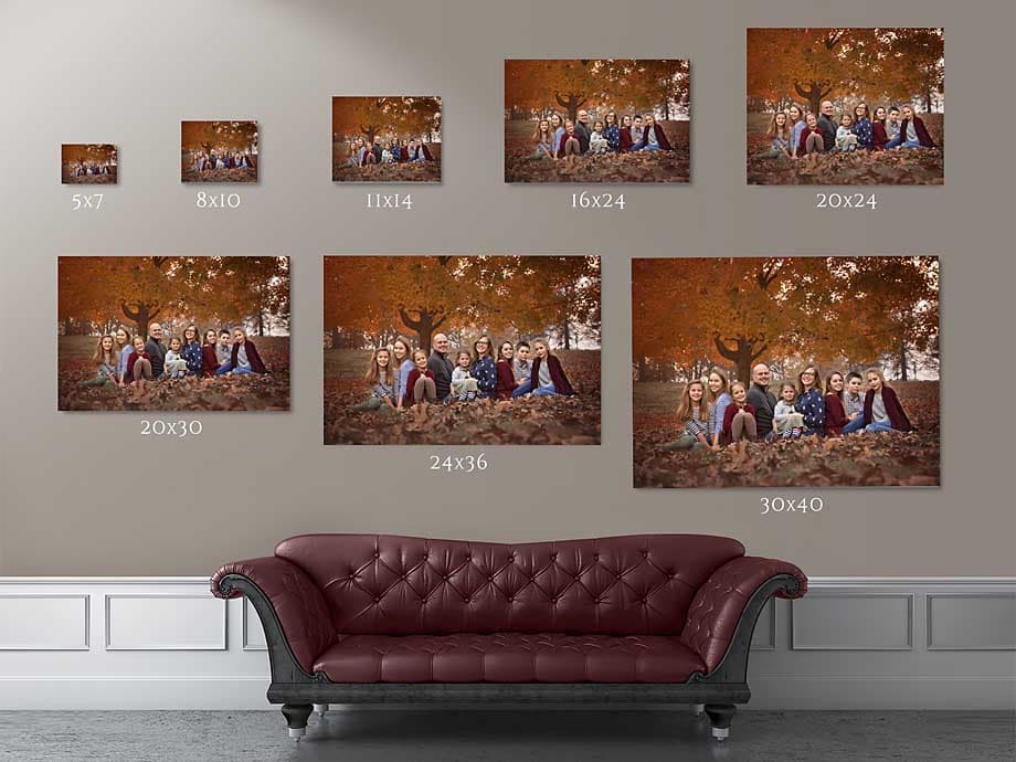
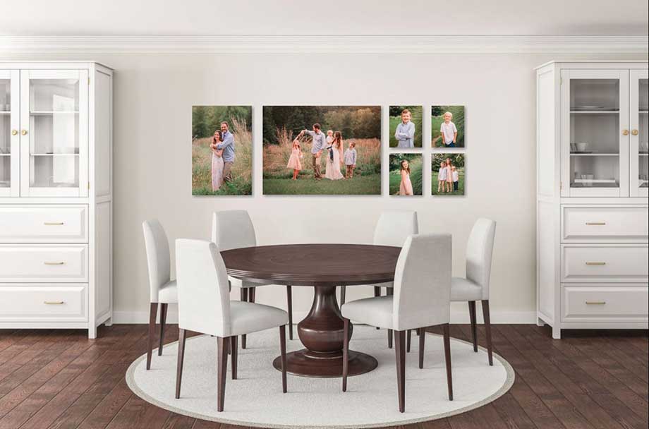
When we go shopping for a TV or a wall decoration, we often think in terms of viewing distance and filling wall space. But when it comes to family portraits, we often think in terms of 8×10’s or 5×7’s. Now, there is absolutely nothing wrong with an 8×10 or a 5×7! However, when you are having custom, professional portraits taken–and those portraits look like stunning works of art of your loved ones–I think it’s time to display a couple of those portraits as beautifully as you can!
The reason why we don’t purchase a TV with an 8×10 screen size is because we actually want to SEE what is on the screen from the comfort of the couch we sit on. The same should be true of portraits. Let me illustrate what I mean…
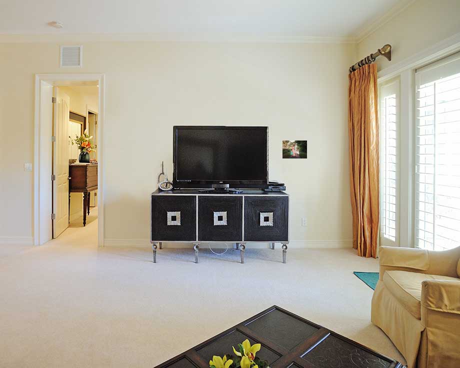
Yes, I can see the TV from where I’m sitting, can’t you? Now how about that family portrait?
You know I can’t leave that there without displaying this family better.
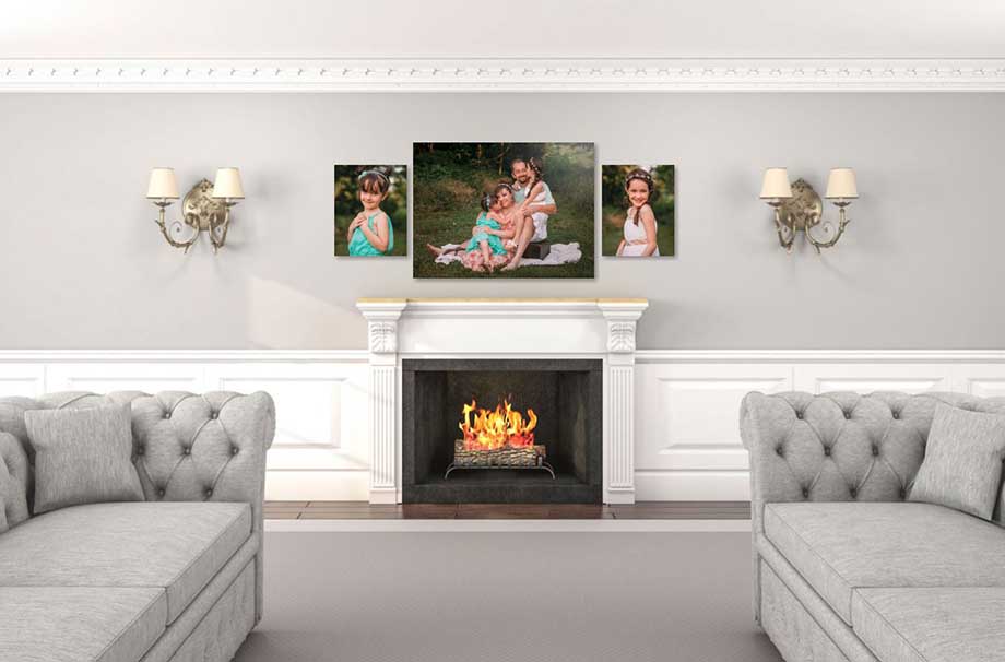
There we go…much better!
My husband and I recently celebrated out 25th wedding anniversary. Of course, I had to take him out for a few pictures. It was important to me to have a beautiful sunset sky in a beautiful place where we were connected in a smaller part of the larger scene. Here is that image…
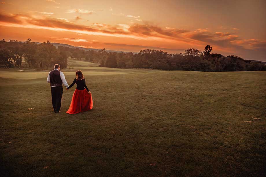
Now, I plan to get a metal of this image to hang on our wall. Because of the scale of the two of us in the scene of the image, here would be an example of an appropriate size of the metal print to put on a wall…
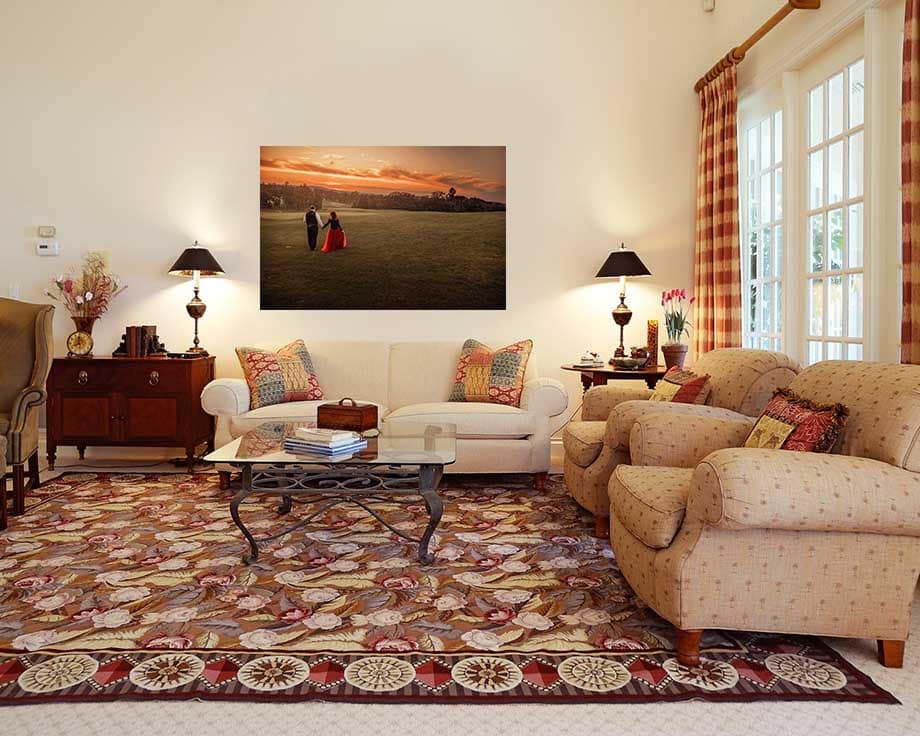
However, here is what that would look like in a 11×14, which is another common small size…
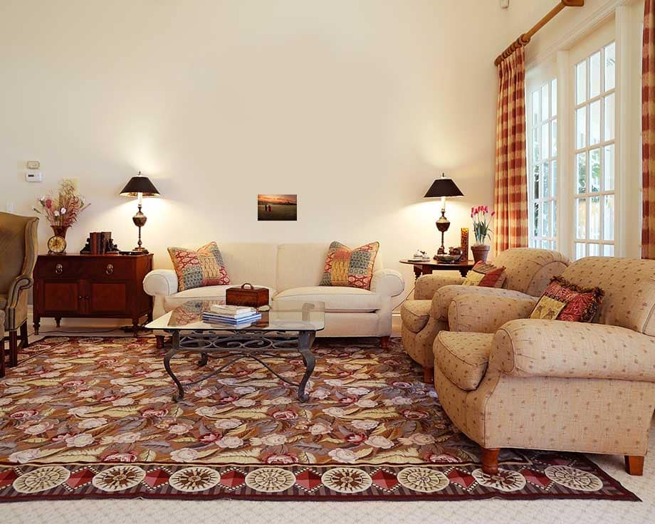
See the difference?
Let me show one more example of size comparisons. This time, I have an 8×10 next to a more appropriate size (24×36) on the wall. I also have an 8×10 in a more appropriate space so you can see the differences…
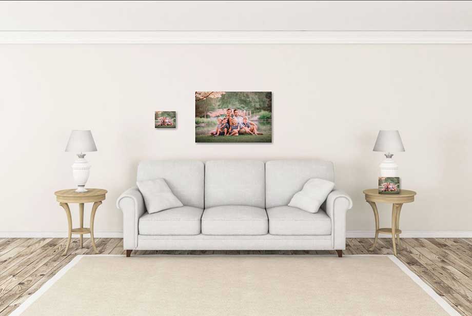
The 8×10 does work well on a small side table. But above the couch? Not so much. I don’t want to have to squint from across the room to see this gorgeous family!
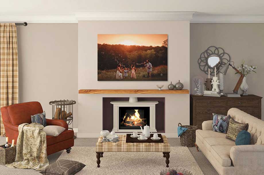
In fact, here is a fabulous size comparison that gives you an idea of how to fill wall space.
Print Mediums
Now that we have talked about sizes, let’s move onto different print mediums. First off, let me address the question of professional vs. consumer prints. Is there a difference? Yes. Absolutely YES. It was a shocking enough difference for me that I very quickly moved from selling digital images only to getting educated and offering professional prints as well. I address that in an article I wrote HERE.
Fine Art Prints: for a very traditional way to display your portraits, you can never go wrong with a standard print. I have each of my prints professionally mounted, and offer framing as well.
Canvas: also a beautiful and traditional way to display your portraits. Canvases have a little more texture and always look a bit like a painting. Canvases can hang on their own, or can be framed. I am always happy to show off examples of each, as I have been incredibly picky about which professional labs I use for canvas, and I love the end result!
Metal: a vibrant way to display your portraits. Metals have a more modern feel, and I love displaying silhouettes and other vibrant colors on this medium.
Acrylic: also has a more modern vibe, and definitely is a more unique way to display stunning portraits.
(Side Note: As far as investment considerations for the above, canvases, metals and acrylics cost more than a fine art print. However, a print usually needs framing while the others come ready to hang on their own. I have found that clients who purchase a fine art print and then have it framed themselves often spend about what they would have spent on purchasing the portrait on a canvas in the first place. If you are wanting a print, that is absolutely fine. But sometimes people go with the print to save money when their preference would have been a canvas or metal. I’ve had more than one person tell me later that they should have just gone with their preference, because in the end the cost was about the same.)
Look for Print Experience
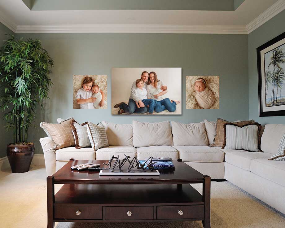
Before the digital age, I would have never needed to say this, as you ALWAYS walked away from a professional portrait session with professionally printed portraits. However, with the ability to purchase digital images, some photographers don’t have experience with printing their work, which can lead to hiccups down the road. It’s important that your portraits don’t look one way on the computer screen, but then print vastly different when you want them in tangible form. There can be a few reasons behind this–and while I’d love to talk shop on this with anyone interested–for the sake of time I’ll leave it at this…find a photographer who knows what they are doing when it comes to displaying your images beautifully in printed form. There are some moments so precious that beauty and quality and archival are a definite MUST HAVE combination when it comes to preserving your images AND displaying your portraits.
The Big Picture
Let’s go back to the family portraits that kicked off this post. The end goal of a portrait session should not be to have all the digital images on a flash drive sitting in a desk drawer. No. In fact, let me plead with you to not short change the end result. Let’s finish the process and have a stunning display of artwork in your home. (I have a fabulous system to help walk you through the process when you have a session with me.)
In the end, I think there is nothing more beautiful you can have on your walls than artwork of those who matter most to you in this world. Think of what you want your home to communicate, especially to them…
“Love lives here.”
“You belong here.”
“We have something beautiful together.”
Those are some of my favorites, anyway.
We would love to hear from you–leave a comment in the comment section!
If you’re looking for a St. Louis photographer, I’d love to visit with you about capturing you or someone you love. Connect with me HERE for details.
Follow Me:
